

The Hidden Stress in Your Home's Colour Palette — What the Research Says
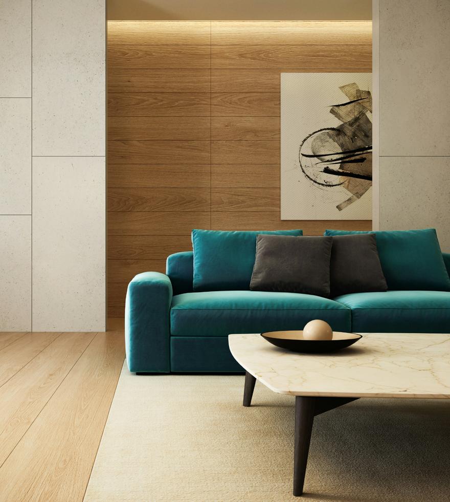
Colour is the design element most people feel most confident about. They know what they like. They have a favourite. They've spent time on Pinterest, they've looked at paint swatches, they have a sense of the palette they're drawn to.
And yet colour is also the element that most consistently produces unexpected results — rooms that feel wrong in ways that are hard to articulate, spaces that look right in photographs but feel exhausting to actually be in.
The gap between what we think we know about colour and what the research actually shows is significant. And closing that gap changes not just how you choose colours, but how you understand what colour is doing to you in every room you inhabit.
COLOUR IS NOT JUST VISUAL
The first thing to understand about colour is that it is not purely a visual experience. Colour affects the nervous system through multiple pathways — not just through the eyes, but through the body's broader physiological response to light and wavelength.
The research on colour and physiology is extensive. Red wavelengths have been consistently shown to increase heart rate, blood pressure, and cortisol levels — the physiological markers of arousal and stress. Blue wavelengths have the opposite effect: they are associated with reduced heart rate, lower blood pressure, and a shift toward parasympathetic nervous system dominance — the state of rest and recovery.
These effects are not subtle. They are measurable, replicable, and significant enough to have practical implications for how we design the spaces where people live, sleep, work, and recover.
This doesn't mean red is bad and blue is good. It means that colour has physiological consequences, and those consequences should be part of how we think about colour in interior design — not as an afterthought, but as a foundational consideration.
WHAT VISUAL LOAD ACTUALLY MEANS
One of the most important concepts in biophilic design is visual load: the amount of information the visual system has to process at any given moment.
High visual load — many competing colours, strong contrasts, busy patterns, dense arrangements of objects — requires cognitive effort. The visual system has to work to make sense of what it's seeing. This effort is not always conscious, but it is always real. It draws on the same cognitive resources that we use for thinking, deciding, and relating to other people.
Low visual load — simple palettes, gentle contrasts, ordered arrangements — requires less cognitive effort. The visual system can process the environment without strain. This frees up cognitive resources for other things: for conversation, for creativity, for rest.
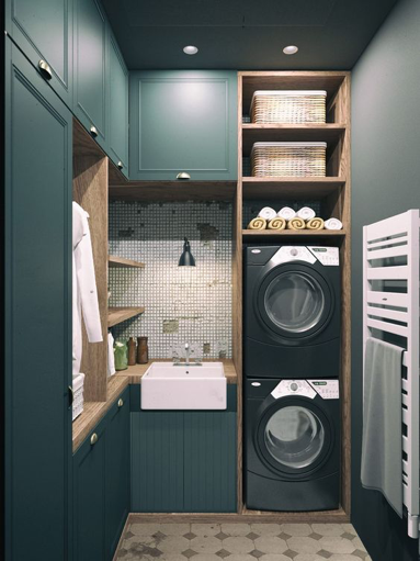
Natural environments tend to have low-to-moderate visual load. The colours of the natural world — the greens of vegetation, the blues of sky and water, the browns and ochres of earth and stone — are varied but harmonious. They don't compete. They don't demand. They create an environment that the visual system can process with ease.
This is one of the reasons that natural colour palettes — palettes drawn from the colours of the natural world — tend to feel more restorative than palettes built around saturated, high-contrast, or highly artificial colours. It's not just aesthetics. It's neuroscience.
THE PROBLEM WITH TREND-DRIVEN COLOUR
Interior design trends move fast, and colour trends move fastest of all. Every year brings a new "colour of the year," a new palette that's everywhere on social media, a new combination that feels fresh and current.
The problem with trend-driven colour is that it optimises for visual impact rather than lived experience. A colour that photographs beautifully — that creates a striking, shareable image — is not necessarily a colour that feels good to live with. High saturation, strong contrast, and bold combinations read well on a screen. They can be genuinely exhausting in a room.
I see this regularly in homes that have been decorated with a strong trend palette. The rooms look great in photographs. The owners are proud of them. And yet they find themselves spending less time in those rooms than they expected — gravitating instead to the quieter, less considered spaces in the house. The bedroom that was painted in a neutral they almost didn't choose. The study with the old furniture and the plain walls.
The spaces that feel genuinely good to be in are rarely the most visually striking. They are the ones where the colour palette supports the nervous system rather than stimulating it.
WHAT A BIOPHILIC COLOUR PALETTE LOOKS LIKE
A biophilic approach to colour is not about choosing beige. It is about choosing colours that are drawn from the natural world, that work together harmoniously, and that create a visual environment the nervous system can inhabit without strain.
In practice, this means:
Saturation that is moderate rather than extreme. The colours of the natural world are rarely fully saturated — they are complex, slightly muted, varied in tone. A forest green that has some grey in it. A terracotta that has some brown. A blue that has some green. These colours feel more natural because they are more natural — they approximate the complexity of colour in the real world rather than the simplified, maximised colour of synthetic dyes.
Contrast that is gentle rather than sharp. High contrast — black and white, bright colour against neutral — creates visual tension. It is energising in small doses and exhausting in large ones. Natural environments have contrast, but it is gradual and varied rather than sharp and binary. A palette that moves through tones rather than jumping between extremes creates a more restorative visual environment.
Warmth that is appropriate to the function of the space. Warm colours — the ochres, terracottas, warm whites, and golden tones — are associated with comfort, safety, and social connection. They are appropriate for living spaces, dining areas, and bedrooms. Cool colours — the blues, greens, and grey-greens — are associated with focus, clarity, and restoration. They are appropriate for home offices, bathrooms, and spaces designed for quiet activity.
Connection to the specific landscape. The most powerful colour palettes I work with are those that draw from the colours of the specific place a home is in. In the Hunter Region, that means the warm ochres and dusty greens of the Australian bush, the blue-grey of the ranges, the warm whites and sandstone tones of the local geology. These colours feel right because they are right — they connect the interior to the exterior in a way that creates a sense of place and belonging.
THE ROLE OF COLOUR IN SPECIFIC ROOMS
Bedrooms are the space where colour has the most significant physiological consequences, because they are the space where the nervous system needs to shift most reliably into a state of rest and recovery. High-saturation colours, strong contrasts, and stimulating palettes work against this shift. Soft, warm, low-saturation palettes support it.
Home offices are the space where the relationship between colour and cognitive performance is most relevant. Research suggests that blue-green tones support sustained attention and creative thinking. Warm neutrals support focus without stimulation. High-saturation colours — particularly red — can increase arousal in ways that are counterproductive for sustained cognitive work.
Living spaces are the space where the social and emotional dimensions of colour are most important. Warm tones support connection and conversation. Cool tones support quiet and reflection. The most successful living spaces often include both — a warm base palette with cooler accents — to support the full range of activities that happen in them.
A DIFFERENT WAY OF CHOOSING COLOUR
The most useful shift I can offer is this: stop choosing colour based on how it looks in isolation, and start choosing it based on how it will feel to live with.
That means looking at colour in the actual light conditions of the room — not on a paint chip under fluorescent lighting. It means living with a large sample on the wall for several days before committing. It means thinking about the function of the space and what physiological state you want to support in it. And it means being willing to choose the quieter, less dramatic option — the colour that doesn't make a statement, but makes a home.
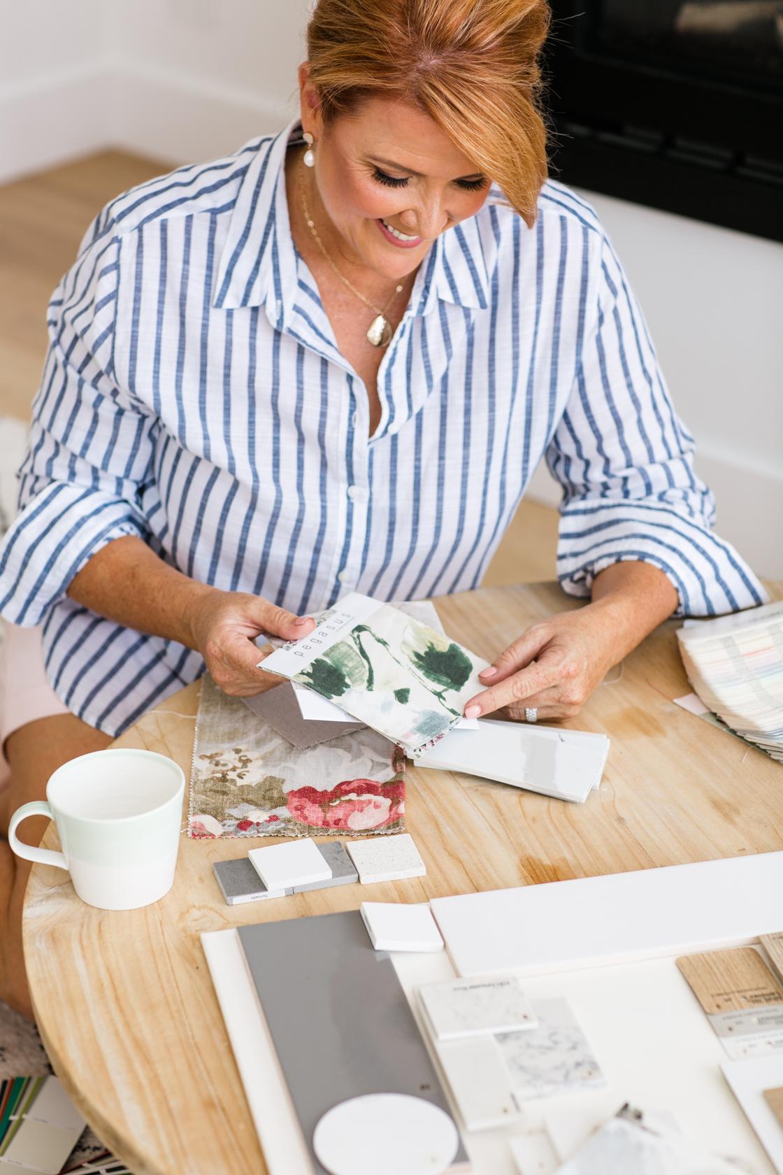
Naomi Findlay is the founder of Findlay & Co., a boutique interior design practice specialising in biophilic wellness design. With a PhD in medical science and over 15 years of experience, Naomi designs spaces for how humans actually feel and live — not just how they look. Findlay & Co. offers in-person design services in the Hunter Region and online consultations Australia-wide.
Want to understand what your home's colour palette is doing to you? Book a discovery call with Findlay & Co.
Want to know more about our services? Leave your details below